https://sfai.edu/blog/joshua-hossain-hashemzadeh-and-semblance-sunshine
Semblance | Sunshine, on view at the Torrance Art Museum through August 29, 2020, traces the material and aesthetic influence of post-war Los Angeles on minimalist art within Southern California from the 1960s to today. SFAI caught up with Joshua Hossain Hashemzadeh (BFA Painting, 2015), co-curator of the exhibition, to discuss the concept, the works, minimalism, his practice, and more. Read on to delve deeper, and go here for more information and additional images of the works.
SFAI: What is the story of the development of this exhibition, where did the idea for it originate? Where did the title come from?
JHH: Ya, I had been in talks for a little while with several artists around LA that had been interested or involved in this period of Southern Californian minimalism between the 1970s and the 1990s and initially we came together to do a show called Re-Verb at Baik Art in Culver City. That exhibition opened up a dialog that articulated minimalism beyond the more recognized 1960s movements and focused on contemporary painting within Los Angeles within that subsequent 30 or so year period. After completing that I had started thinking about a show that could chonolog a broader view of minimalism in LA and that would basically link the “light & space” and “finish fetish” movements to contemporary works that embodied similar thinking today. That show later became, Semblance | Sunshine.
The title was something I played with for a while, but it’s pretty much a nod to the Sunshine Noir show from the late 90s which intended to present a chronological overview of art and cultural influences happening in LA from 1960 - 1997.
SFAI: What have you observed in the changing landscape of minimalism from the 1960s to today in the context of this exhibition?
JHH: I think the biggest distinction from the 1960s to today is the ability for that kind of “classic minimalist aesthetic” to exist in works that don’t solely play to the kind of viewing experience that Judd and Stella championed in New York. I think “minimalism” can celebrate the traditions that they, and others in the West like Helen Pashgian, Mary Corse, and Larry Bell set in motion, while opening up the stylistic approach to allow for metaphor and personal or historical narratives. It really, in its broadest sense, has become a tool for anyone to articulate their environment and ideas via this reductive material-centric approach. It becomes somewhat evident when you see how much conceptual artists and minimalists overlap in the way they view, make, or conceptualize their work. Which is ironic because both modes of thinking kind of came into existence in opposition to one another lol. I think that’s why including artists who haven’t always been thought of in the same vein as that 1960s standard was important for this exhibition. It allowed us to show how widely those initial material and aesthetic influences had become to generations of artists living here and to the story of the city itself.
SFAI: The exhibition statement mentions breaking away from regimented traditions and instead presenting “reductive art objects that are informed by local Southern California environments, subcultures, and communities”. Can you say more about the particular environments, subcultures, and communities that inform any of the particular works in the show?
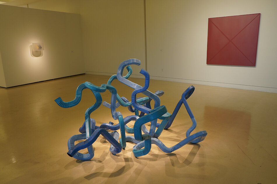
JHH: I think every artist is always making work that’s influenced by the things around them or their personal interpretations of the world. Though you do start to see things in Semblance | Sunshine that allude to more specific narratives within Los Angeles like in Alex Israel’s Bigg Chill, Lynn Aldrich’s Stream in the Desert, or Aaron Sandnes’s Death Marks the Spot (1964 Pontiac).
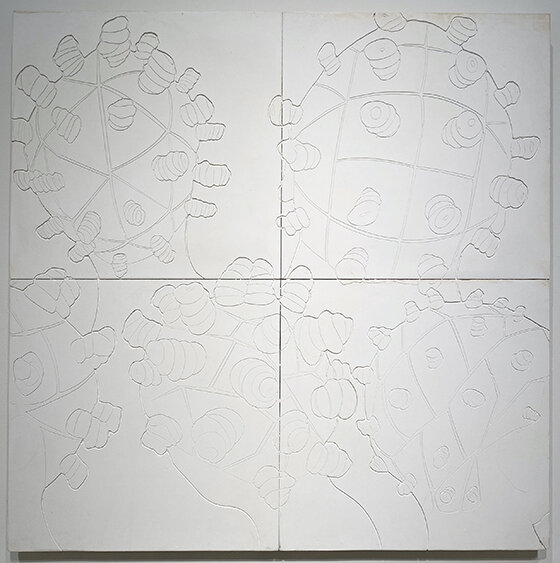
Perhaps, one of the clearest examples though, could be Lauren Halsey’s Untitled, as it draws on her hyper-local experience in South Central where citizens are perpetually faced with the pressures of economic transformation and the displacement of their cultural history. The subjects in the work are turned from the viewer, leaving only the racially charged signifier of their hair to cement the figures identity while floating aimlessly in an otherwise voyeuristic and minimal space. I immediately think about this lack of permanence that we see so often in LA. Nothing is grounded. No center or familiar faces to identify with, merely bodies consumed by this gesture of development & displacement. There’s maybe no better place than the communities within South Central to personify this fraught history within Los Angeles. It reminds us of all the ugliness and shortcomings of our judicial systems and the systematically biased infrastructures we still hold onto today. From food deserts, to a lack of accessible capital, education, and racially influenced urban planning, these residents have been in large part barred from the economic prosperity that LA has witnessed decade after decade.
However, I also read the work as a celebration of these communities. The power of embracing ones’ self via personal style and the preservation of culture through institutionalized art can be immensely transformative. I think representation is key here, and this hieroglyphic-esque depiction is a badass way to breathe hope into a region that birthed some of Southern California’s greatest cultural influences.
From Hip-hop to 90s street fashion the legacy of this community is seen everywhere around the globe despite having so much stacked against it. It not only articulates these subcultures and experiences but also our collective capacity for social reform and cultural preservation.
The work, to me, is a bit of a throwback to Rauchenbergs white-paintings, from Black mountain college. Only instead of rooting the experience of the work in the indexical variables of an institutional setting, like John Cage’s 4:33. Lauren etches, quite literally, the experiences and expressions of her community into artworks that the city’s collectors and institutions are now tasked with protecting. Kind of becomes a performative take on indexical mark making in and of itself.
SFAI: What do you anticipate will be in store for the future of minimalist art in Los Angeles?
JHH: I don’t have a crystal ball, but I like to think these aesthetics will always be tied to Southern California in some way. There’s a presence here that just provokes that kind of thinking. I assume artists are going to be faced with digital spaces more and more in the future and minimalism will have to figure out how to adapt to that lack of physicality. Luckily it still photographs well. The real issue is it’s not always very accessible and people generally don’t like that. You’d be amazed at how many people want to fight over a red square lol. The austerity can be problematic at times, but it helps to understand the genre as a language of contemplation where you want to use the simplest constructions to achieve the maximum result. That approach is and will be pretty important in how we navigate the future so I’m sure there will be artists that continue this tradition however that may be.
SFAI: How does curating interrelate with your art practice? Does your practice engage any of the themes in this exhibition?
JHH: The two overlap a lot. When I curate I typically am trying to explore something I’m also trying to articulate in my art practice. But it takes a lot of time as an artist because you’re trying to imagine and then construct an object that says everything you want where as a curator you can point to it after it already exists. So I feel like there’s a benefit from doing both. One is understanding the object and the other is understanding it in space.
In regard to specific themes, I would definitely say there’s a lot of art history in my work some of it relates to minimalism and some of it doesn’t. Things are so fluid now it's sometimes hard to tell. Movements like Dada, Fluxus, and Bauhaus will always be pretty important to me tho and I think there are themes of minimalism in all three.
SFAI: What other projects have you been working on recently? What’s next?
JHH: I’m working on a series of small art objects that I called Reliquary-Memes, they’re vintage LA postcards that get encased in wooden containers and layers of resin and paint. Think Ken Price meets Dustin Yellin.
Other than that I’m playing with a couple exhibition ideas. Want to do something that speaks about a desire for objects in a world that is increasingly ephemeral. Not totally sure yet but I’m focusing a lot on the idea of collections and collecting. There are a few other projects in the air but I think like most people I’m just trying to make it through the year and see what happens next.
Joshua Hashemzadeh (b. 1993), has a BFA from the San Francisco Art Institute (2015) and lives and works in Los Angeles. His work, often varying in mediums, is built around an investigation of language and its links to art-historical pedagogy, socio-economic critique, and cultural iconicism. Recent works have been featured in several exhibitions in Los Angeles, San Francisco, and New York with recent highlights being: Office Hours, Main Museum, Los Angeles; FIVE, Baik Art, Los Angeles; Poster, Black Ball Projects, Brooklyn; LA Art Show 2017, Los Angeles; Critique of Reason, MRG Fine Art, Los Angeles; and Our little Angle, Diego Rivera Gallery, San Francisco. The artist also maintains a curatorial practice with recent highlights including Semblance | Sunshine, Torrance Art Museum, Torrance; the 2020 Armory Show, New York; Re-Verb, Baik Art, LA; Felix Art Fair, Roosevelt Hotel, Hollywood, and Henosis, Baik Art Seoul, South Korea.
Image credits, top to bottom; all images courtesy of Torrance Art Museum:
Left to right: Helen Pashgian, Untitled (GR9), 2016. Formed acrylic, 12 x 18.25 x 13 inches; Lynn Aldrich, Streams in the Desert, 2017. Galvanized steel downspouts and elbows, exterior enamel, 53 × 86 × 56 inches; Aaron Sandnes, Death Marks the Spot (1964 Pontiac), 2016. Automotive paint on wood panel, 60 x 60 x 1 3/4 inches.
Clockwise from top left: Math Bass, Yellow Gate, 2014. Powder coated steel, 81 x 42 x 27 inches; Lauren Halsey, Untitled, 2020. Hand-carved gypsum on wood, 48 x 48 x 1 7/8 inches; Juan Capistran, The Text is the Beginning of the Plan, 2016. Stack of paper prints, 6.5 x 19.25 x 13 inches; Laddie John Dill, Ohio Blue Tip, 1969. Argon gas, glass tubing, 88 x 1/2 inches.
Claudia Parducci, Life Line (series), Cast bronze, Dimensions variable.
Lauren Halsey, Untitled, 2020. Hand-carved gypsum on wood, 48 x 48 x 1 7/8 inches.
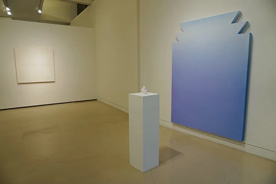
Left to right: Lauren Halsey, Untitled, 2020. Hand-carved gypsum on wood, 48 x 48 x 1 7/8 inches; Alex Israel, Untitled (Flat), 2012. Acrylic on stucco, wood and aluminum frame, 84 x 60 inches; Alex Israel, The Bigg Chill, 2012-13. Marble and styrofoam cup, 5 x 3.5 x 3.5 inches.


